R Scatter Plot
Scatter Plots
You learned from the Plot chapter that the plot() function is used to plot
numbers against each other.
A "scatter plot" is a type of plot used to display the relationship between two numerical variables, and plots one dot for each observation.
It needs two vectors of same length, one for the x-axis (horizontal) and one for the y-axis (vertical):
Example
x <- c(5,7,8,7,2,2,9,4,11,12,9,6)
y <-
c(99,86,87,88,111,103,87,94,78,77,85,86)
plot(x, y)
Result:
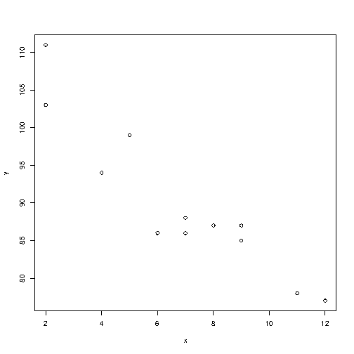
The observation in the example above should show the result of 12 cars passing by.
That might not be clear for someone who sees the graph for the first time, so let's add a header and different labels to describe the scatter plot better:
Example
x <- c(5,7,8,7,2,2,9,4,11,12,9,6)
y <-
c(99,86,87,88,111,103,87,94,78,77,85,86)
plot(x, y, main="Observation
of Cars", xlab="Car age", ylab="Car speed")
Result:
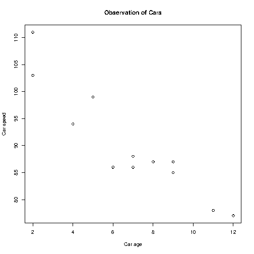
To recap, the observation in the example above is the result of 12 cars passing by.
The x-axis shows how old the car is.
The y-axis shows the speed of the car when it passes.
Are there any relationships between the observations?
It seems that the newer the car, the faster it drives, but that could be a coincidence, after all we only registered 12 cars.
Compare Plots
In the example above, there seems to be a relationship between the car speed and age, but what if we plot the observations from another day as well? Will the scatter plot tell us something else?
To compare the plot with another plot, use the points() function:
Example
Draw two plots on the same figure:
# day one, the age and speed of 12 cars:
x1 <- c(5,7,8,7,2,2,9,4,11,12,9,6)
y1 <- c(99,86,87,88,111,103,87,94,78,77,85,86)
# day two, the age and speed of 15 cars:
x2 <-
c(2,2,8,1,15,8,12,9,7,3,11,4,7,14,12)
y2 <-
c(100,105,84,105,90,99,90,95,94,100,79,112,91,80,85)
plot(x1, y1,
main="Observation of Cars", xlab="Car age", ylab="Car speed", col="red",
cex=2)
points(x2, y2, col="blue", cex=2)
Result:
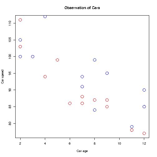
Note: To be able to see the difference of the comparison, you must assign different colors to the plots (by using the col parameter). Red represents the values of day 1, while blue represents day 2. Note that we have also added the cex parameter to increase the size of the dots.
Conclusion of observation: By comparing the two plots, I think it is safe to say that they both gives us the same conclusion: the newer the car, the faster it drives.

