Data Science - Statistics Correlation Matrix
Correlation Matrix
A matrix is an array of numbers arranged in rows and columns.
A correlation matrix is simply a table showing the correlation coefficients between variables.
Here, the variables are represented in the first row, and in the first column:
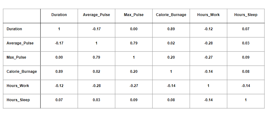
The table above has used data from the full health data set.
Observations:
- We observe that Duration and Calorie_Burnage are closely related, with a correlation coefficient of 0.89. This makes sense as the longer we train, the more calories we burn
- We observe that there is almost no linear relationships between Average_Pulse and Calorie_Burnage (correlation coefficient of 0.02)
- Can we conclude that Average_Pulse does not affect Calorie_Burnage? No. We will come back to answer this question later!
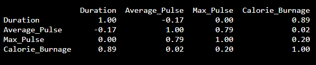
Correlation Matrix in Python
We can use the corr() function in Python to create a correlation matrix. We
also use the round() function to round the output to two decimals:
Output:
Using a Heatmap
We can use a Heatmap to Visualize the Correlation Between Variables:
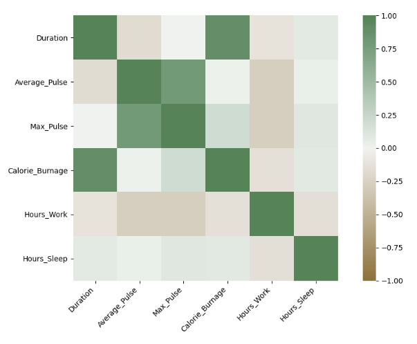
The closer the correlation coefficient is to 1, the greener the squares get.
The closer the correlation coefficient is to -1, the browner the squares get.
Use Seaborn to Create a Heatmap
We can use the Seaborn library to create a correlation heat map (Seaborn is a visualization library based on matplotlib):
Example
import matplotlib.pyplot as plt
import seaborn as sns
correlation_full_health =
full_health_data.corr()
axis_corr = sns.heatmap(
correlation_full_health,
vmin=-1, vmax=1, center=0,
cmap=sns.diverging_palette(50,
500, n=500),
square=True
)
plt.show()
Try it Yourself »
Example Explained:
- Import the library seaborn as sns.
- Use the full_health_data set.
- Use sns.heatmap() to tell Python that we want a heatmap to visualize the correlation matrix.
- Use the correlation matrix. Define the maximal and minimal values of the heatmap. Define that 0 is the center.
- Define the colors with sns.diverging_palette. n=500 means that we want 500 types of color in the same color palette.
- square = True means that we want to see squares.

