Accessibility Color Alone as Meaning
Why
Not everyone perceives color the same way. Red-green color blindness is the most common form, it affects up to 8% of males. Some use grayscale mode to curb their phone addiction.
What
Do not use color as the only visual indicator of a meaning.
The most common example of this is to style links without underline or border.
Browsers underline hypertext links by default. It is possible to remove the underline using Cascading Style Sheets (CSS), but this is a bad idea most of the time. Users are accustomed to seeing links underlined.
WebAIM: Links and Hypertext
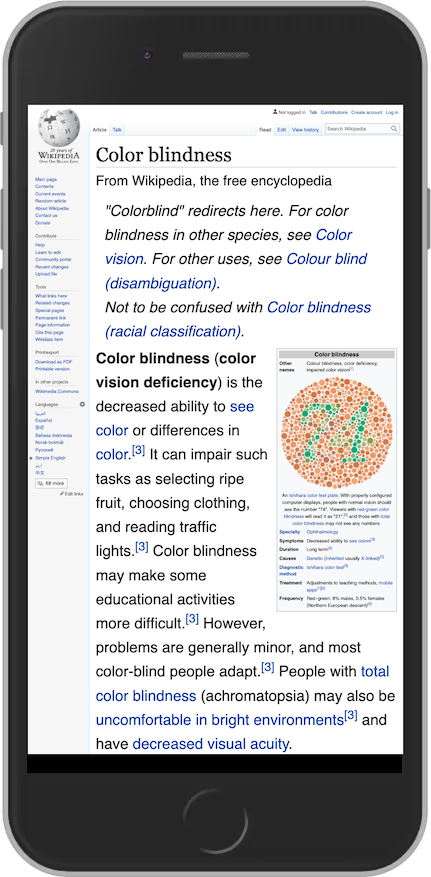
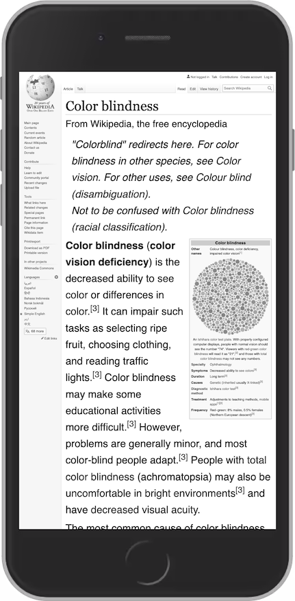
Wikipedia is one example where color alone is used for styling links. In the grayscale version of the site, it is not possible to see what is plain text and what is a link.
How
Underlined links
Add underline to links. Or, do not remove them. Keep in mind that they can reduce readability.

To improve readability, we can use CSS properties like text-underline-offset and text-decoration-color.
text-underline-offset and text-decoration-color to improve readability.Color as status
Add text and/or icons to communicate meaning, in addition to color.
Tools
Note: The following tools gives a rating for the contrast assuming that you are using it as text color.
Many combinations that are not suitable as background/color combinations, are perfectly usable as colors for graphics, buttons, etc.
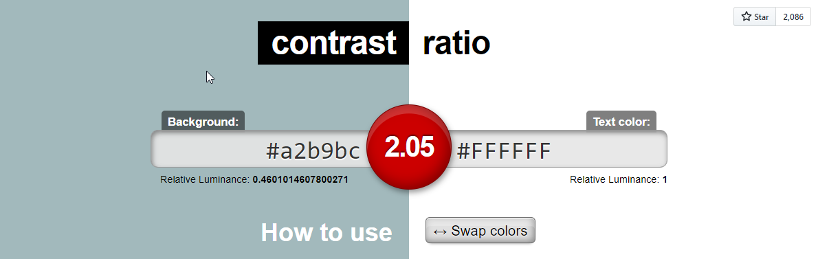
The tool Contrast Ratio uses color to communicate if a color contrast is good or not. Red means bad contrast. In this example you might say that the number is another indicator. That is a valid argument. However, you are then assuming that the user understands the metric contrast ratio and knows about the guidelines.
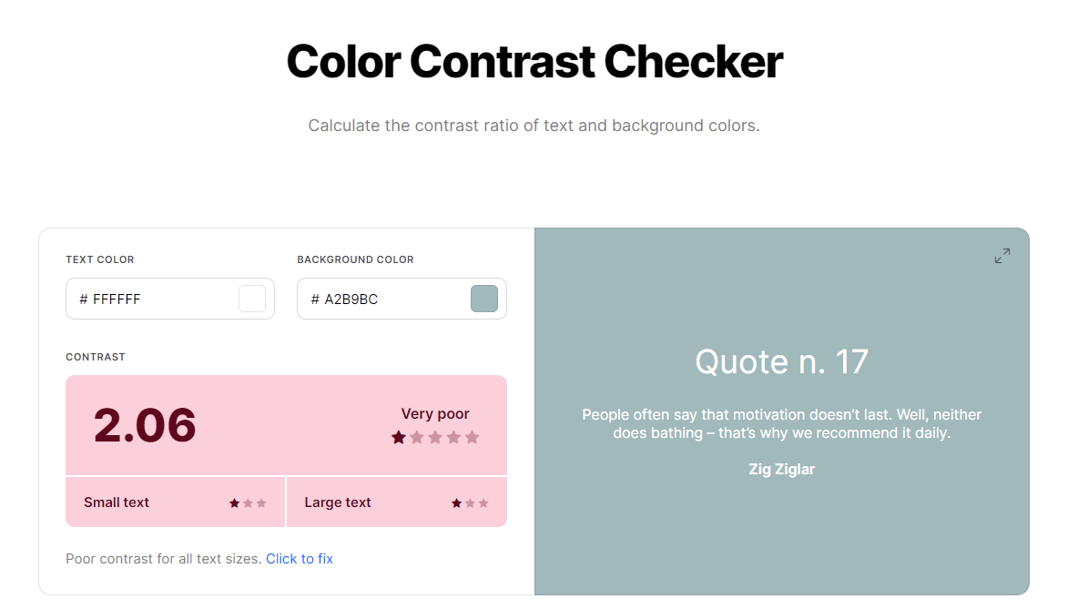
The tool Coolors Color Contrast Checker uses three methods to tell us whether or not a color combination is good:
- The red color tells us that the contrast is bad.
- The text Very poor tells us that the contrast is b… very poor.
- 1 of 5 stars tells us that this is really bad.
Do not rely on color alone. Do like Coolors, use two or three methods.

