Accessibility Link States
Why
Different link states help users interact with the links. A visited state can help a person with short-term memory loss to understand which content has been read. A hover state can help a person with reduced muscle control to know when to click. A focused link helps keyboard users to know which link they are about to activate.
What
Links hardly needs an introduction. They are the heart of the web. A link has many states. Here are five of the most common states. In CSS terms, these are pseudo-classes:
- Unvisited
- Visited
- Hover
- Active
- Focus
How
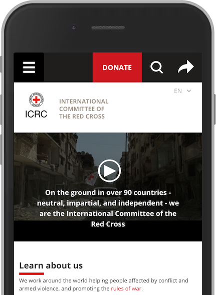
To make sure that all link states are accessible, we must remember these three tips. We will use an example from the front page of ICRC, the International Committee of the Red Cross.
1. Underline
Links are underlined by default. Removing the underline from a link in body text is a bad idea most of the time. We learned this in the section about color alone. This is most important for unvisited and visited links.
In the example from ICRC, there is one link in the body text – rules of war. Without underline. Let us remove the text-decoration: none; from the stylesheet:
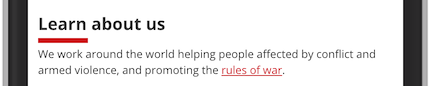
Now the link is accessible to people with color blindness.
2. Contrast and focus
All states must have sufficient contrast, as we learned in color contrast. In addition, a focused link must have sufficient contrast to the unfocused state.
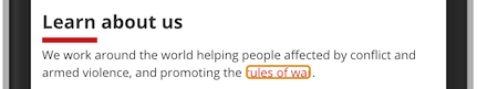
Now the link rules of war is in a focused state. The text has an orange outline without any offset. This focus state has two problems. First, the orange outline has low contrast compared to the white background. Second, the lack of offset makes the text hard to read. Let us use the red color that is already in the color palette of the site, and let us add some offset.
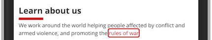
Much better! A focused link that is accessible for people that are using a keyboard to navigate and/or has reduced vision.
This improvement used the CSS properties outline-color and outline-offset.
3. Hover
A clear hover state is helpful for everyone, especially people with motor impairments.
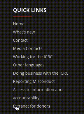
In the footer of ICRC you can see a collection of quick links. They have a very subtle hover state, changing the color from light grey to white. This effect can be improved.
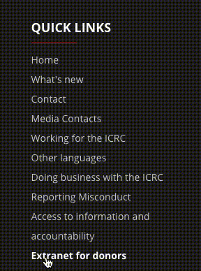
In this example we have added one effect for the hover state, bold text. It is now clearer what action the user is about to do.

