Accessibility Page Zoom
Why
People with low vision need to zoom the content in order to use the page.
What
The big brother of text zoom is page zoom. Zoom everything! The principles are easy to understand:
- Avoid horizontal scrolling.
- All content is available.
- All functionality is available.
- Avoid text in images.
- Provide space for key content.
Available means that nothing is clipped, truncated or obscured.
Page zoom often triggers mobile view on responsive sites, which is good.
How
You will now learn five techniques to support page zoom.
Provide enough space for key content
Do not let secondary content occupy the screen.
Hidden icons

In this example from Samsung India, the page is zoomed 400 %. The content is scaling properly. No horizontal scrollbar. However, the chat button occupies a big part of the browser window. It is not easy to access the buttons for search, cart or menu. And the quality of the button graphic is low. In addition, there is a huge ad for an app.
Improvements:
- Add a minimize button for the chat button. Use the minimized version as the default.
- Use vector graphics like SVG instead of raster graphics like PNG.
- Show mobile ads only for mobile devices.
No clutter
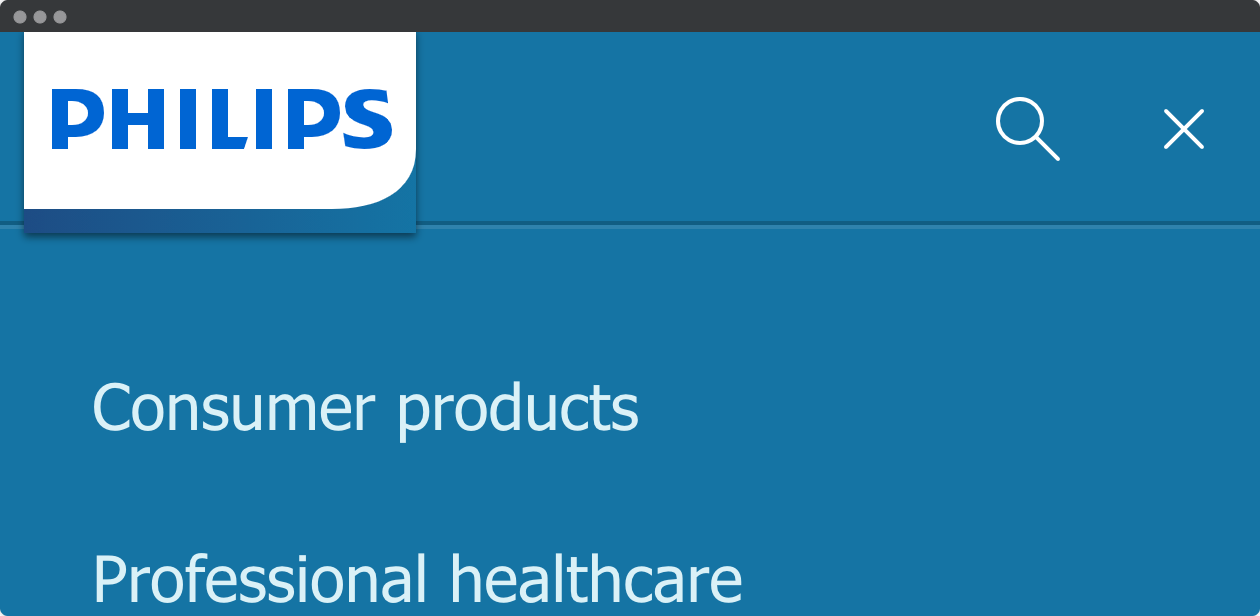
In this example from Philips, the entire viewport is available for main content. The main navigation is opened, and there is no clutter. The text and graphics are scaled well.
The viewport is set:
<meta name="viewport" content="width=device-width, initial-scale=1">
Learn more about responsive web design.
Avoid horizontal scrolling
Scrolling in two dimensions is confusing.
Fixed width
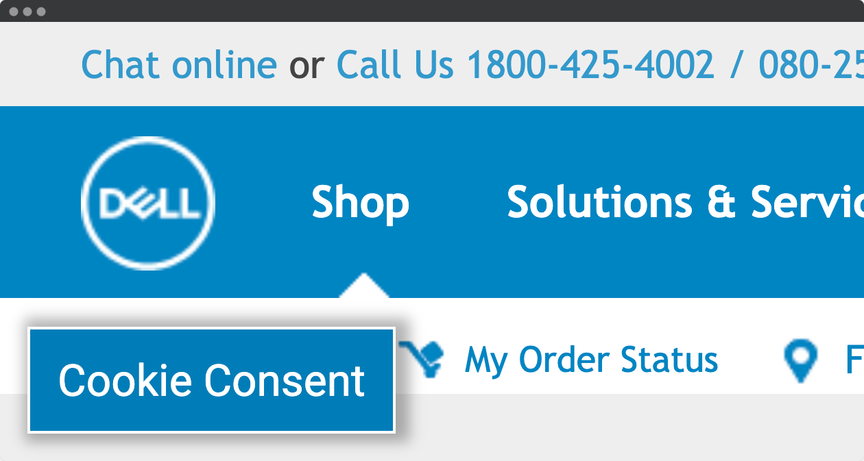
In this example from Dell, we can only see a small part of the header. The site does not scale when zoomed. The result is a large horizontal scroll that makes it hard to navigate the page in two dimensions.
In addition, the cookie consent button is fixed, not possible to remove even though the consent is given. The logo and the icons are low resolution PNGs that does not scale well. Viewport is not set.
Improvements:
- Make the site responsive.
- Add a minimize button for the cookie button. Use the minimized version as the default.
- Use vector graphics like SVG instead of raster graphics like PNG.
All content and functionality is available
No content should be hidden when zoomed.
Hidden tabs
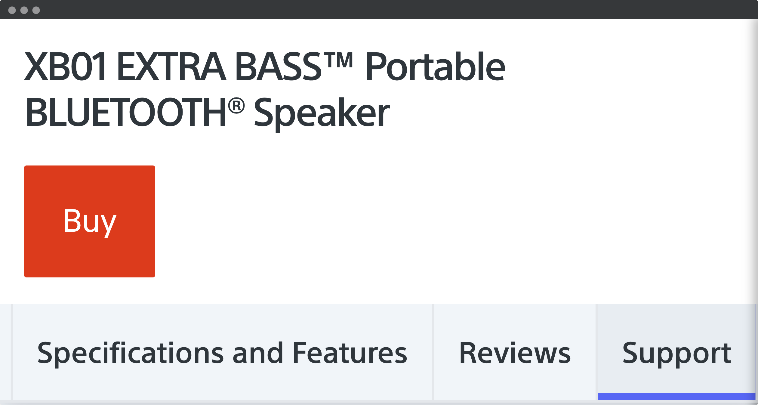
In this example from Sony, the tabs with product information is not accessible in a desktop browser with page zoom. Even if the user scrolls, the scrolling is happening outside of the browser window. All the specifications, features, reviews and support are inaccessible. The problem is that the entire section is "sticky":
<section class="sticky-nav">
.sticky-nav {
position: fixed;
z-index: 1035;
top: 0;
}
This section is 159 pixels high in a mobile view. When zoomed four times, the fixed section occupies 636 pixels of the desktop view. With a browser height of 720 pixels, minus the top part of the browser, leaves not much room for the main content.
Fixed content is not necessarily inaccessible. The takeaway is that you should always test your site with page zoom in common browser sizes.
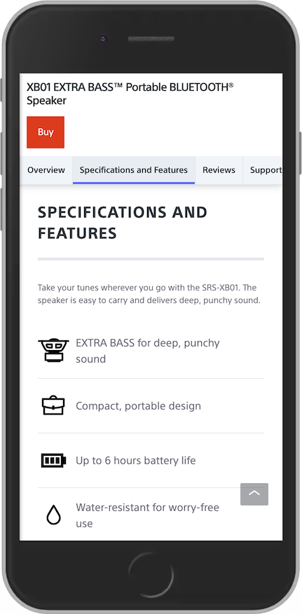
In a mobile view, the content beneath the tabs is accessible.
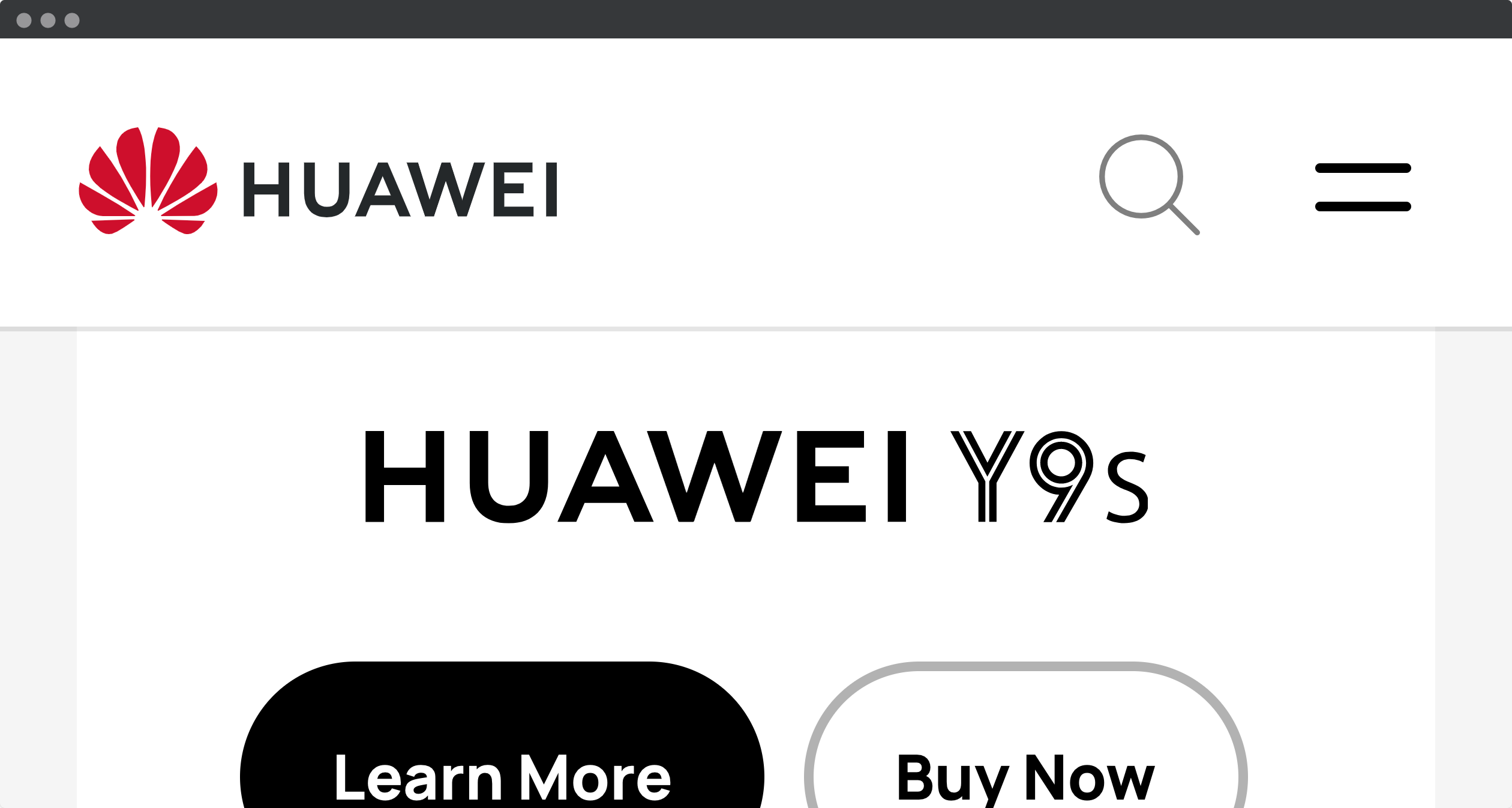
The sticky navigation from Huawei is not too high, so there are enough space for the main content.
Avoid text in images
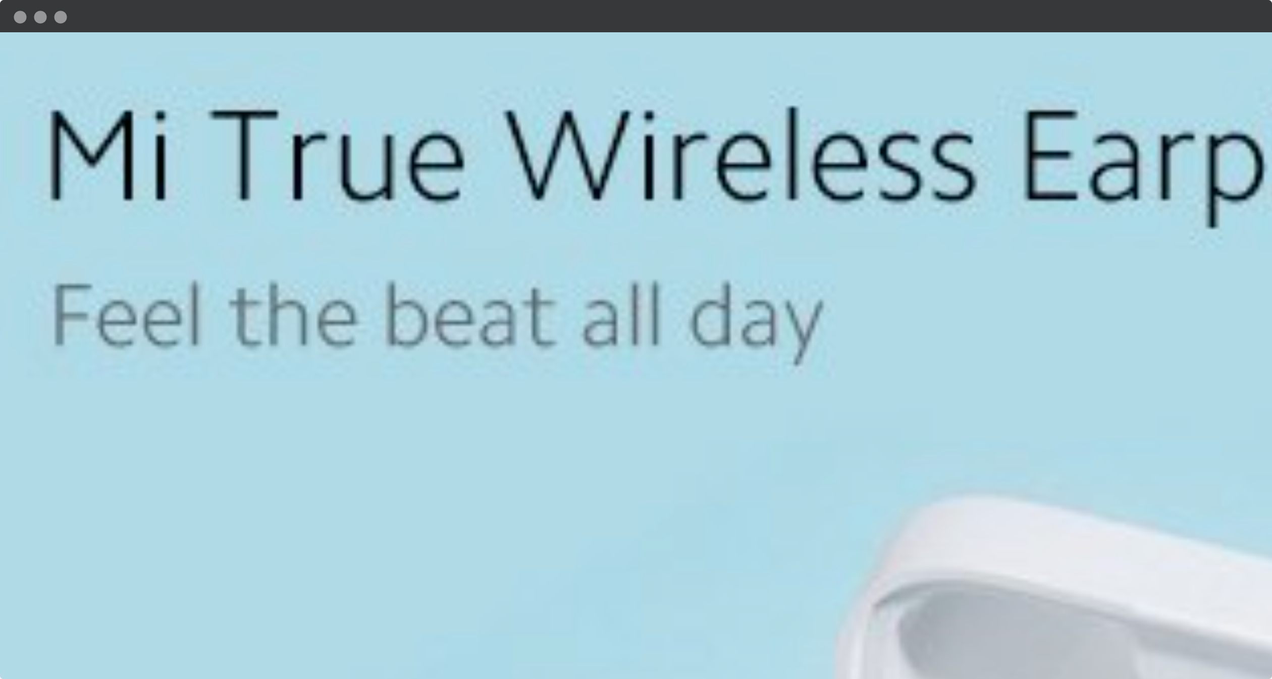
In this example from Xiaomi, the zoomed text is pixelated because it is part of the image. Parts of the text is also outside the browser window, so that the user has to scroll to read the entire product title. Displaying text with pure HTML and CSS has many benefits, in addition to be accessible: responsive, translatable and searchable.

