Excel Line Charts
Line Charts
Line charts show the data as a continuous line.
Line charts are typically used for showing trends over time.
In Line charts, the horizontal axis typically represents time.
Line charts are used with data which can be placed in an order, from low to high.
Note: Data which can be placed in an order, from low to high, like numbers and letter grades from A to F are called ordinal data. You can read more about ordinal data at Statistics - Measurement Levels.
Excel has six types of line charts:
- Line (
 )
) - Line with Markers (
 )
) - Stacked Line (
 )
) - Stacked Line with Markers (
 )
) - 100% Stacked Line (
 )
) - 100% Stacked Line with Markers (
 )
)
Line
Line charts are used for showing data ordered from low to high.
Example
Let's see the stats change for Bulbasaur evolutions.
Copy the values to follow along:

- Select the range
A1:C4for labels and data
Note: This menu is accessed by expanding the ribbon.
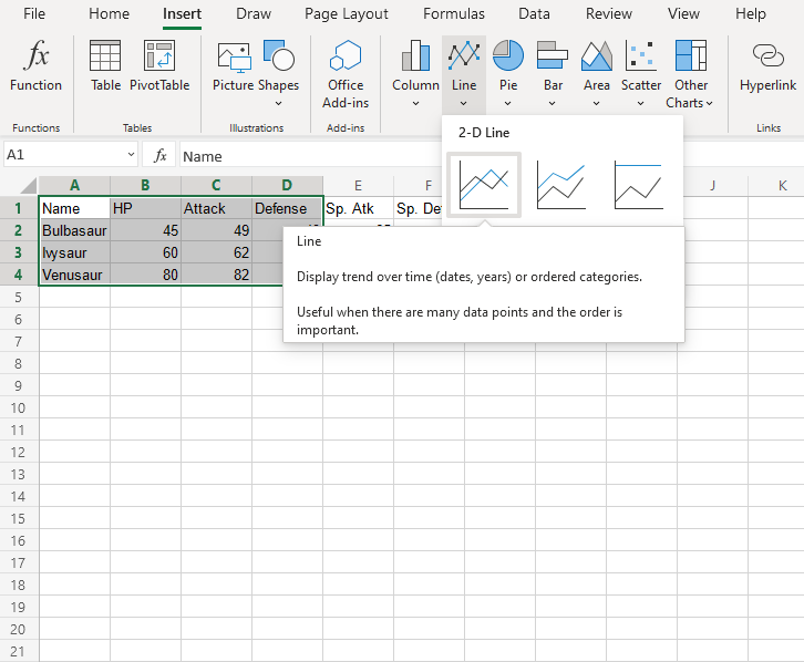
- Click on the Insert menu, then click on the Line menu (
 ) and choose Line () from the drop-down menu

You should get the chart below:
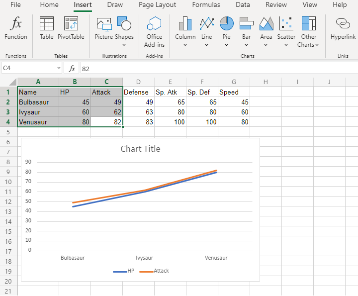
The chart gives a visual overview for the Pokemon stats.
Bulbasaur evolutions are shown on the horizontal axis.
HP stat is shown in blue and Attack stat is shown in orange.
The chart shows that with each evolution, the stats increase.
Fantastic! Now let's plot more stats on the chart.
- Select the range
A1:D4for labels and data
- Click on the Insert menu, then click on Line menu () and choose Line () from the drop-down menu
You should get the chart below:
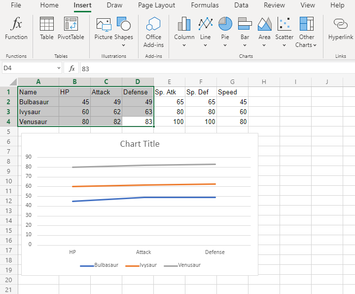
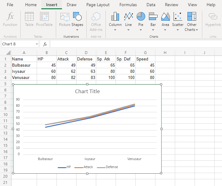
Wait a minute. Something doesn't seem right.
Suddenly, Bulbasaur's evolutions are not shown on the horizontal axis. Instead, it is the stats.
What's happening?
Note: Excel checks the number of rows and columns included in the chart and automatically places the larger number on the horizontal axis.
Luckily, there is a simple fix.
Click on the the chart, then chick on the Chart tab and finally Click on Switch Row/Column.
The outcome is this chart which has Bulbasaur evolutions on the horizontal axis.
Line with Markers
Line with markers highlights data points with markers on a line chart.
Example
Let's chart the average HP, Attack and Defense over all the Pokemon generations.
Copy the values to follow along:
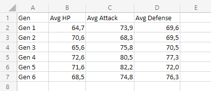
- Select the range
A1:D7for labels and data
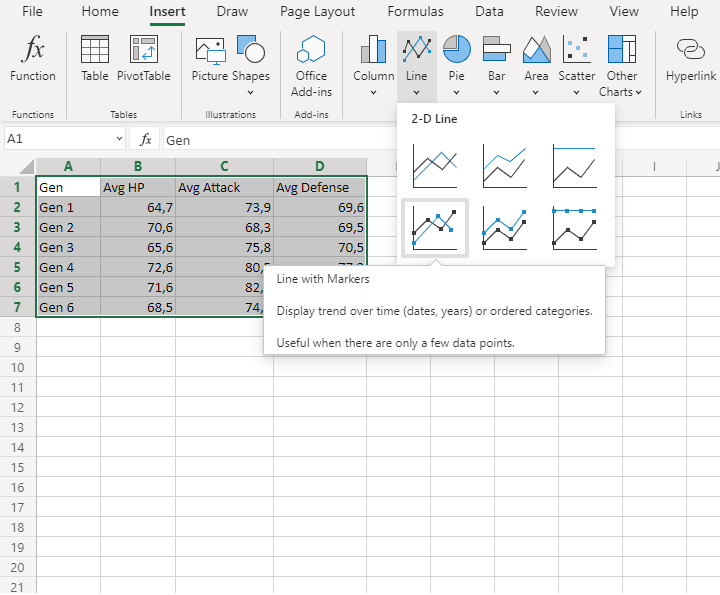
Note: This menu is accessed by expanding the ribbon.
- Click on the Insert menu, then click on the Line menu () and choose Line with Markers () from the drop-down menu
You should get the chart below:
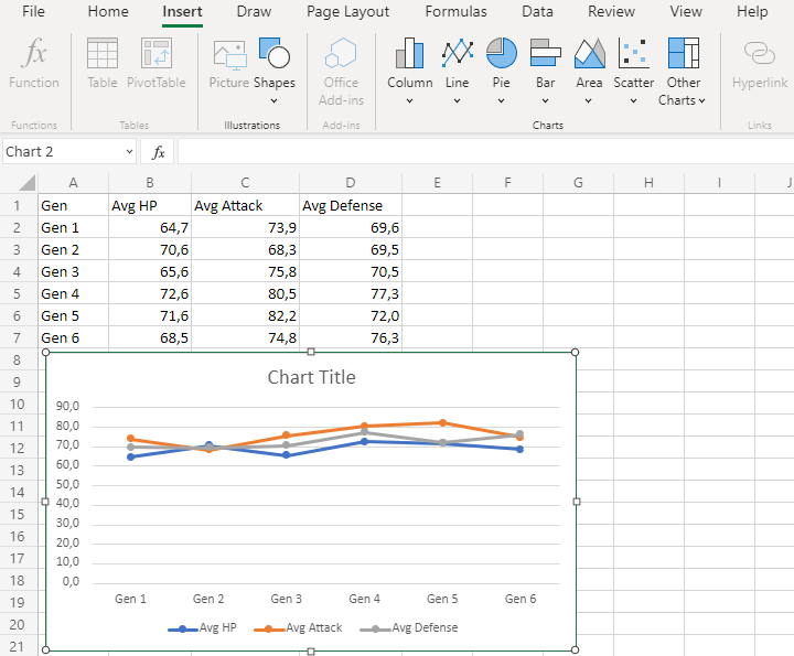
The chart gives a visual overview for average Pokemon stats over generations.
Average HP is shown in blue, average attack is shown in orange and average defense is shown in gray.
The horizontal axis shows the generations.
This chart shows that the average of all stats in the 2nd generation is very close to each other and 5th generation Pokemon have on average the highest attack.

