Excel Pie Charts
Pie Charts
Pie charts arrange the data as slices in a circle.
Pie charts are used for representing values of qualitative (categorical) data.
Pie charts show the contribution of each category to the total.
Note: You can read more about qualitative (categorical) data at Statistics Data Types.
Excel has two types of pie charts:
- 2-D pie (
 )
) - Doughnut (
 )
)
2-D Pie Chart
Pie charts arrange the data as slices in a circle.
2-D pie charts are used when you only have one data column.
Example
Showing the proportion of 1st generation Grass, Fire, Water, and Bug type Pokemon.
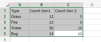
You can copy the values to follow along:
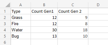
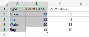
- Select the range
A1:B5
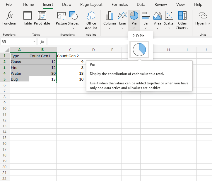
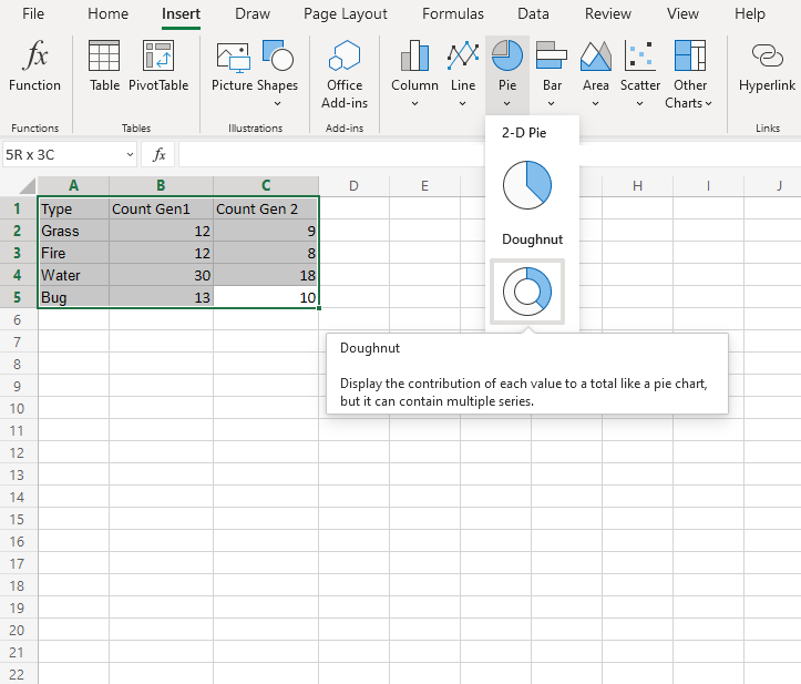
- Click on the Insert menu, then click on the Pie menu (
 ) and choose Pie () from the drop-down menu
Note: This menu is accessed by expanding the ribbon.
You should get the chart below:
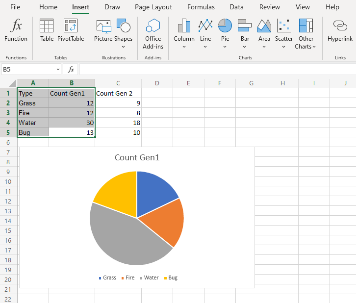
The chart gives a visual overview of the number of 1st generation Grass, Fire, Water and Bug type Pokemon.
Type "Grass" is shown in blue, "Fire" in orange, "Water" in gray and "Bug" in yellow.
Type "Water" has the most Pokemon in the first generation.
Note: The chart can be customized by adding labels. This can make it easier to understand the differences between categories.
Doughnut Chart
Doughnut charts arrange the data as slices in a circle with hollow center.
Doughnut charts are often used when you have more than one data column.
Note: A doughnut chart with one data column shows the same information as a 2-D pie chart.
Example
We want to find the proportion of types "Grass", "Fire", "Water" and "Bug". in generation 1 Pokemon and compare it to the proportions in generation 2.
You can copy the values to follow along:
- Select the range
A1:C5
- Click on the Insert menu, then click on the Pie menu () and choose Doughnut () from the drop-down menu
Note: This menu is accessed by expanding the ribbon.
Following the steps above, you will get the following chart:
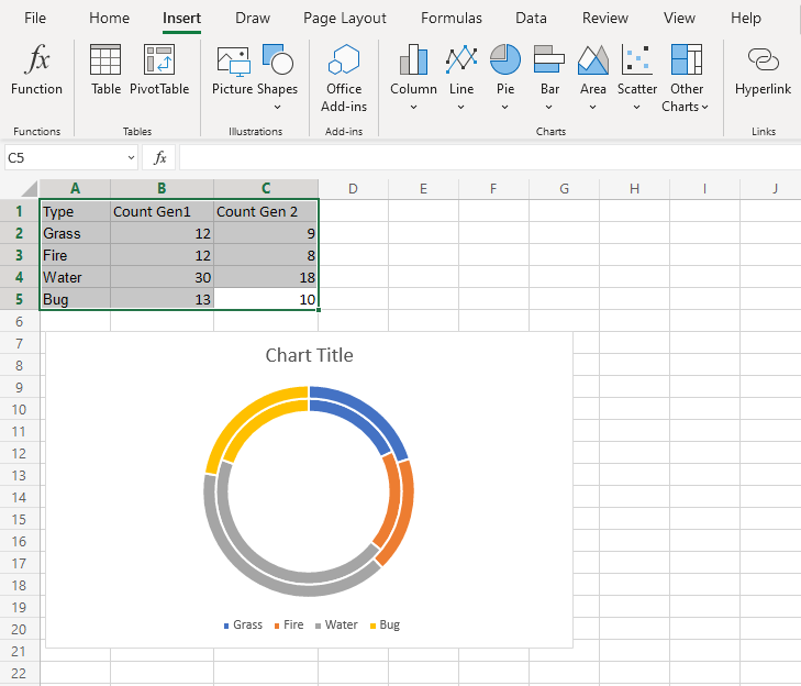
The chart gives a visual overview of the number of 1st and 2nd generation Grass, Fire, Water and Bug type Pokemon.
Generation 1 Pokemon are shown in the inner circle and generation 2 Pokemon are shown in the outer circle.
Type "Grass" is shown in blue, "Fire" in orange, "Water" in gray and "Bug" in yellow.
This chart shows that "Water" type Pokemon are the most common in both generations.
Note: The chart can be customized by adding labels. This can make it easier to understand the differences between different categories.
Note: Based on this chart, you cannot say which generation has more Pokemon.

